
2023
Mobile and Web App
Gratta e Vinci Storefront
Evolving the legacy of the Italian most played scratch and win game.
Services
UX/UI Design, Testing
Role
Senior UX Designer
Domain
Gaming
Company
Brightstar Lottery
Intro
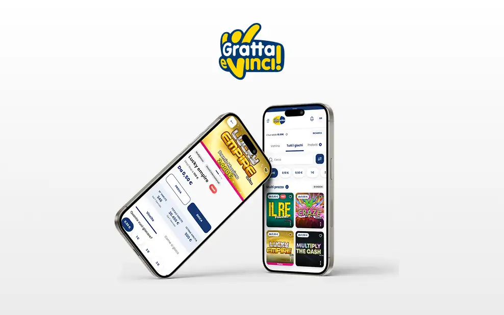
A Legacy Platform Holding the Product Back
The existing Gratta e Vinci storefront was showing its age: limited filtering, no real personalization, and recurring integration issues with retail partners. More importantly, it undersold the product — a catalog this rich deserved a browsing experience that made discovery effortless, not one users had to fight through.
Redesigning it meant rethinking the storefront for a primarily mobile audience of millions, without losing the brand's 30-year cultural weight.
Information Architecture
Designing for screens you dont' control
The storefront isn't a standalone product — it's embedded across dozens of third-party retailer platforms I have no control over. Every design decision had to hold up inside environments with different technical constraints, different surrounding UI, and no guarantee of consistent rendering. I designed for resilience first: components that degrade gracefully rather than break, and a visual language distinct enough to stay recognizable as Gratta e Vinci regardless of what platform it's embedded in.
Information Architecture
Usability
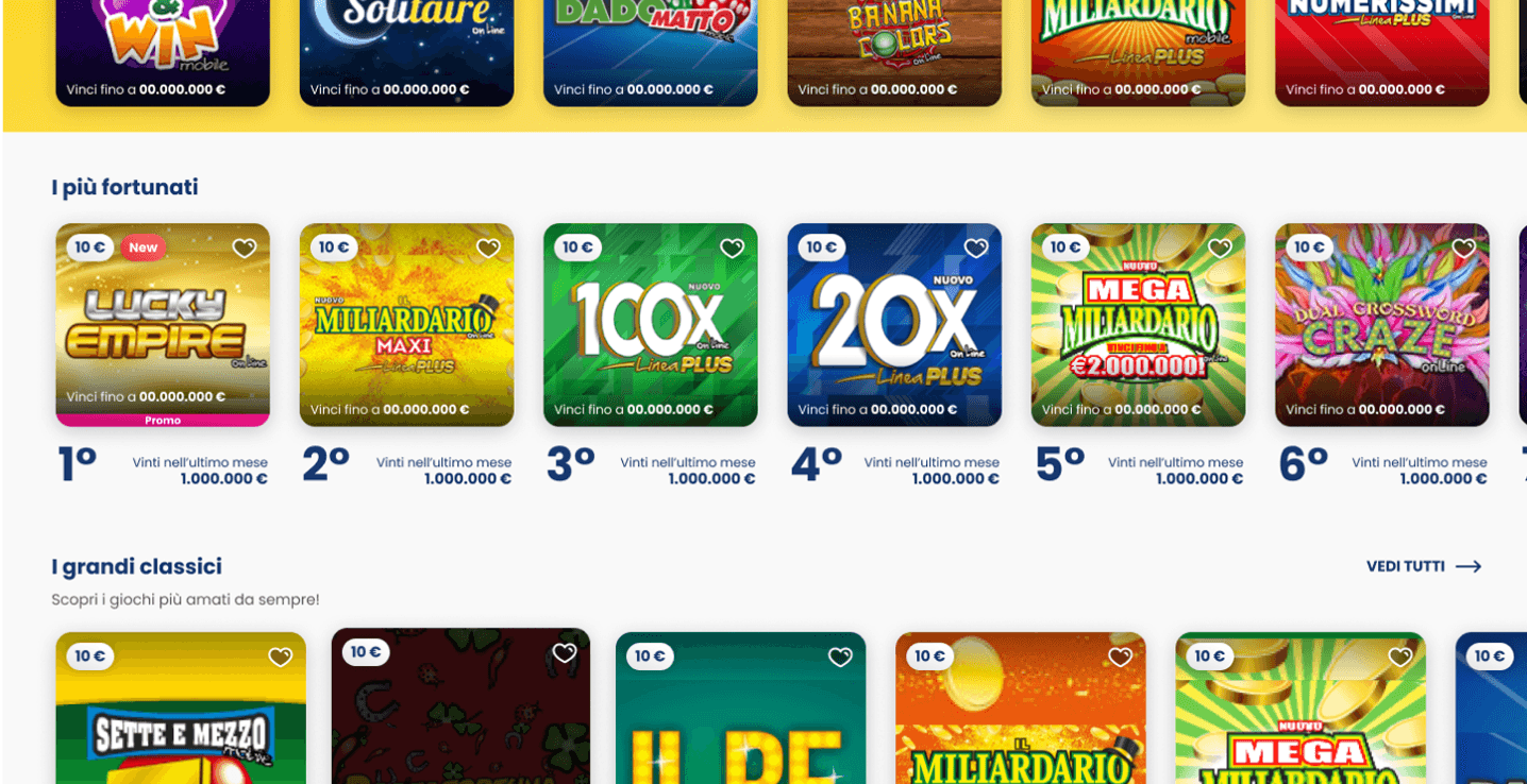
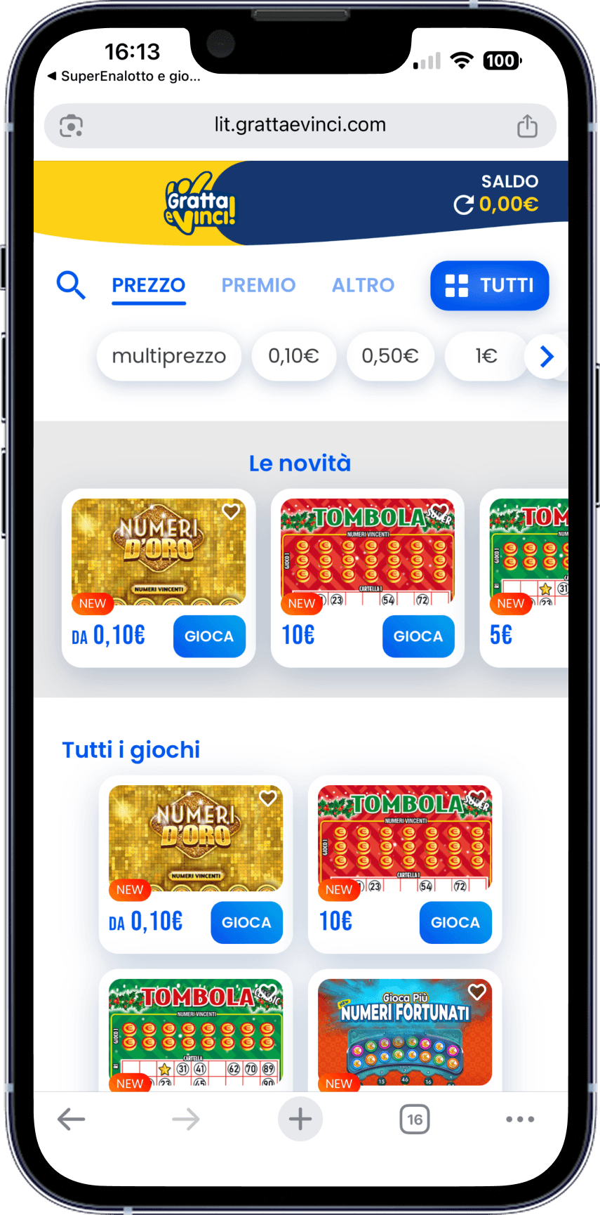
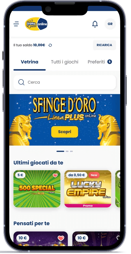
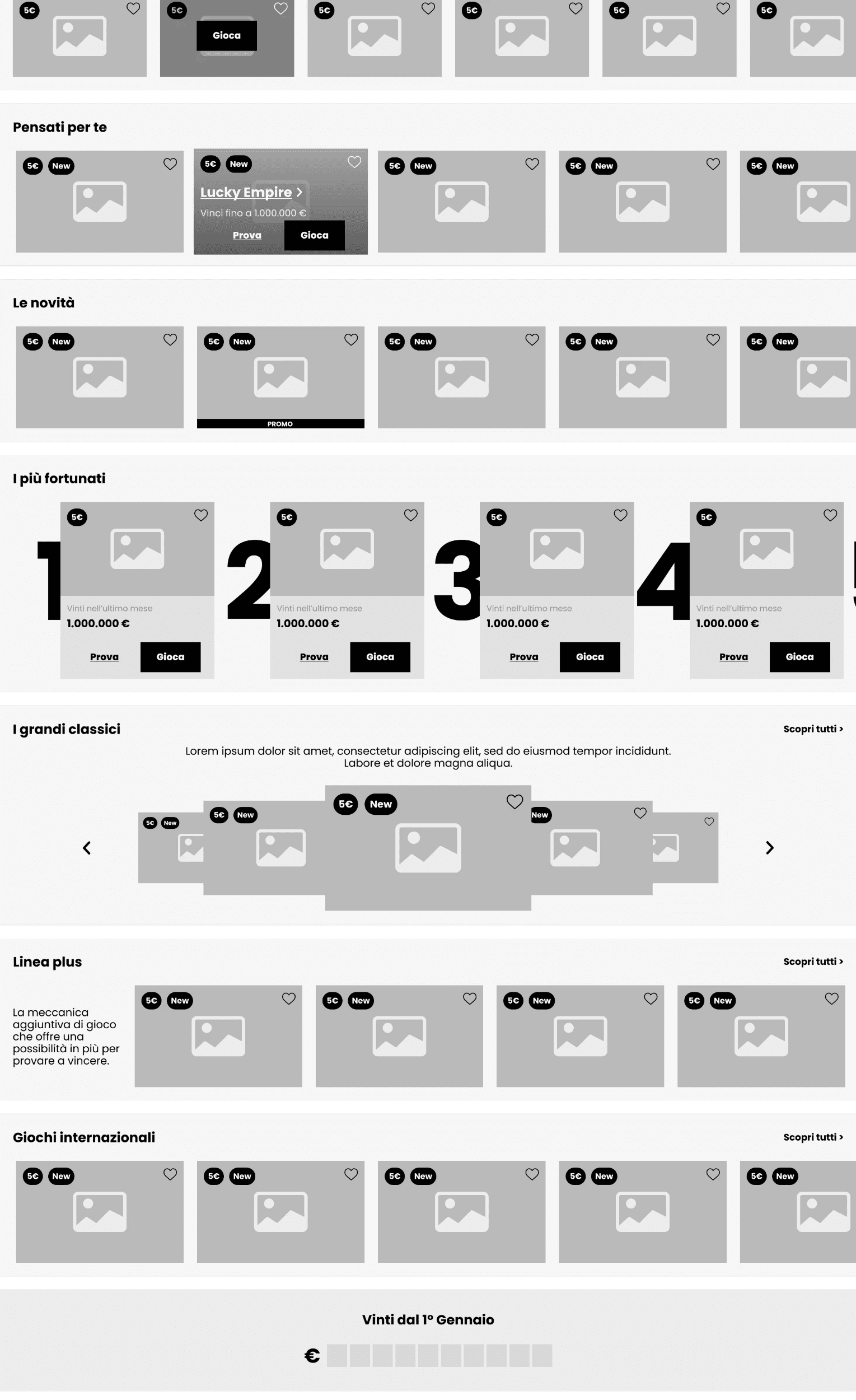
Following user research, we restructured the information architecture to reduce friction and center the experience around key actions: discovering new games, resuming recent ones, and accessing favorites.
We introduced a new landing page—the Showcase—highlighting new releases, recent activity, and weekly themes. A rail-based layout ensured content remained clear and scannable.
Core navigation was completed with:
All Games: a searchable, filterable catalog of the full Gratta e Vinci lineup.
Favorites: a personal space to save and revisit preferred games.
This new structure simplified navigation and boosted engagement by aligning with real user behaviors.
A deep analysis was conducted to restructure the game card - main access for our games.
Design Process
The Card Is the Product
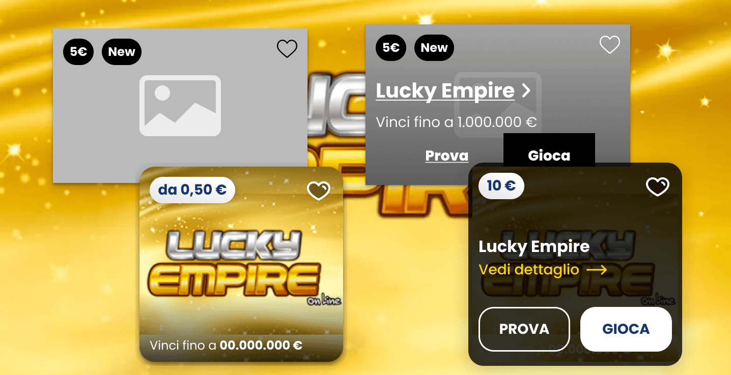
The game card redesign was a crucial part of improving user access. As the primary touchpoint for entering a game, each card needed to be both clear and functional, allowing users to quickly understand the game's features.
We analyzed various interaction models to refine the experience, ensuring that players can easily access key information and start playing with minimal effort.
The result is a sleek, intuitive card design that enhances usability and streamlines the path to gameplay.
Research and Validation
Testing With Real Players
I wrote the research script and ran qualitative usability testing in person with real users, rather than relying on assumptions or stakeholder opinion to validate the new structure. That direct contact with players shaped decisions the data alone wouldn't have surfaced — including how people actually described "finding a game," which didn't always match our internal categorization.
Accessibility
Built for WCAG
Accessibility was assessed against WCAG standards throughout the redesign — contrast, touch target sizing, and navigability — rather than reviewed only at the end. For a product used by a broad, non-technical, often older audience, this wasn't a compliance checkbox; it was core to whether the redesign actually worked for the people using it.
Impact
The new structure — Showcase, All Games, Favorites — replaced a flat, hard-to-navigate catalog with a browsing experience organized around how players actually look for games, validated directly through in-person testing rather than assumption. The card redesign reduced the interaction model from four competing options down to the one users consistently completed fastest and with the least hesitation during testing.